Designing for Africa's Modern Farmers
A full end-to-end UX design project — from research and wireframes through to a polished iOS app helping African users manage there farms through smart design.
Role
Lead Designer
Timeline
8 Weeks
Team
Solo + 2 Developers
Tools
Figma, Balsamiq

OVERVIEW
SmartAgri: Product Vision
FarmSwitch is the core task layer of Smart-Agri Africa, a SaaS platform positioning itself as a "Farmer in a Box". Giving farm operators a single source of truth for planning, assigning, and tracking field work. The brief was ambitious: support every farm type across sub-Saharan Africa while remaining affordable and usable by workers with limited literacy or consistent connectivity.
I joined as the solo designer with two developers already on scope. The product hadn't shipped yet and the roadmap covered essentially everything. My first call was to shrink it.

IMPACT
ACHIEVEMENTS
The first iteration of task related functionality of the app was launched. An 13% increase in task completion for onsite farmers, than when previously executed through paper and word of mouth systems.
Designs were used in gaining more shareholder funding for the company, gaining an 7% increase in funder revenue since positive feedback from relevant farm networks that used the app.
Enhancing Visual language and easy use of usability on the mobile version, improving user complaints.
PROBLEM
The Challenge: Digitising African Agriculture
A paperwork based system still rains supreme in the African Market of farm management. This is due to several reasons but a main one is poor investment in technological efforts. The client observed the needs in farming largely vary in its functions from every farm which demands a system that can be widely used by all farmers regardless of the kind of farming they are doing.
The Key challenges in developing this product:
Scope that was genuinely too broad
The initial roadmap tried to serve onsite farmers, farm managers, input suppliers, and external funders in version one. Every stakeholder had legitimate needs, which made prioritisation a political conversation, not just a design one.
Architecture that needed to flex without becoming complicated
Farming activities vary enormously, a maize farm and a poultry operation share almost no workflows. The system had to accommodate that without presenting users with an overwhelming number of options at any given step.
Front-end that had to scale to a data-heavy web version later
The iOS app was phase one, but the design language needed to port cleanly to a web dashboard for managers and funders. Every component decision I made in the app had downstream implications for the web build.
APPROACH
Designing for Simplicity at Scale
Before sketching a single screen, I needed to understand what farming actually looked like day-to-day for the people who would be using this app. Working closely with the SmartAgri team, I got direct access to real onsite farmers — which made a real difference in how grounded our research became.
I conducted user interviews with the SmartAgri farmer network to build on the initial requirements that had already been gathered by the business analyst on our team. What I was looking for wasn't just feature needs — I wanted to understand the mental model a farmer carries when they're out in the field, often without reliable signal, often working across multiple crop types at the same time.
What I was listening for
Not what features they wanted — what decisions they were making under pressure, and what made those decisions harder than they needed to be. Feature requests tell you what people ask for. Watching someone manage a task through a foreman's verbal instruction tells you what the system actually has to do.
Three clear themes came out of those conversations.
Task clarity — farmers weren't struggling because farming is complicated, they were struggling because communication was fragmented. Word of mouth from managers, paper notes that get lost or rained on, no single source of truth for what needed doing first.
Information overload — when we showed early dashboard concepts, the consistent feedback was that there was too much on screen at once. Farmers wanted to see what was relevant today, not the entire state of the farm.
Trust in technology — this was the quietest theme but probably the most important one. Older farmers in particular weren't going to adopt something that felt fragile. Simplicity wasn't just a usability preference, it was a trust signal.
Where research didn't give a clean answer
Farmers consistently said they wanted "less on screen", but the task detail page legally and operationally needed to carry a lot of information: input quantities, proof-of-completion uploads, approval actions. Research said simplify. The product said include everything. I had to make a call without a clear right answer, and we shipped with progressive disclosure rather than waiting to test a third option.
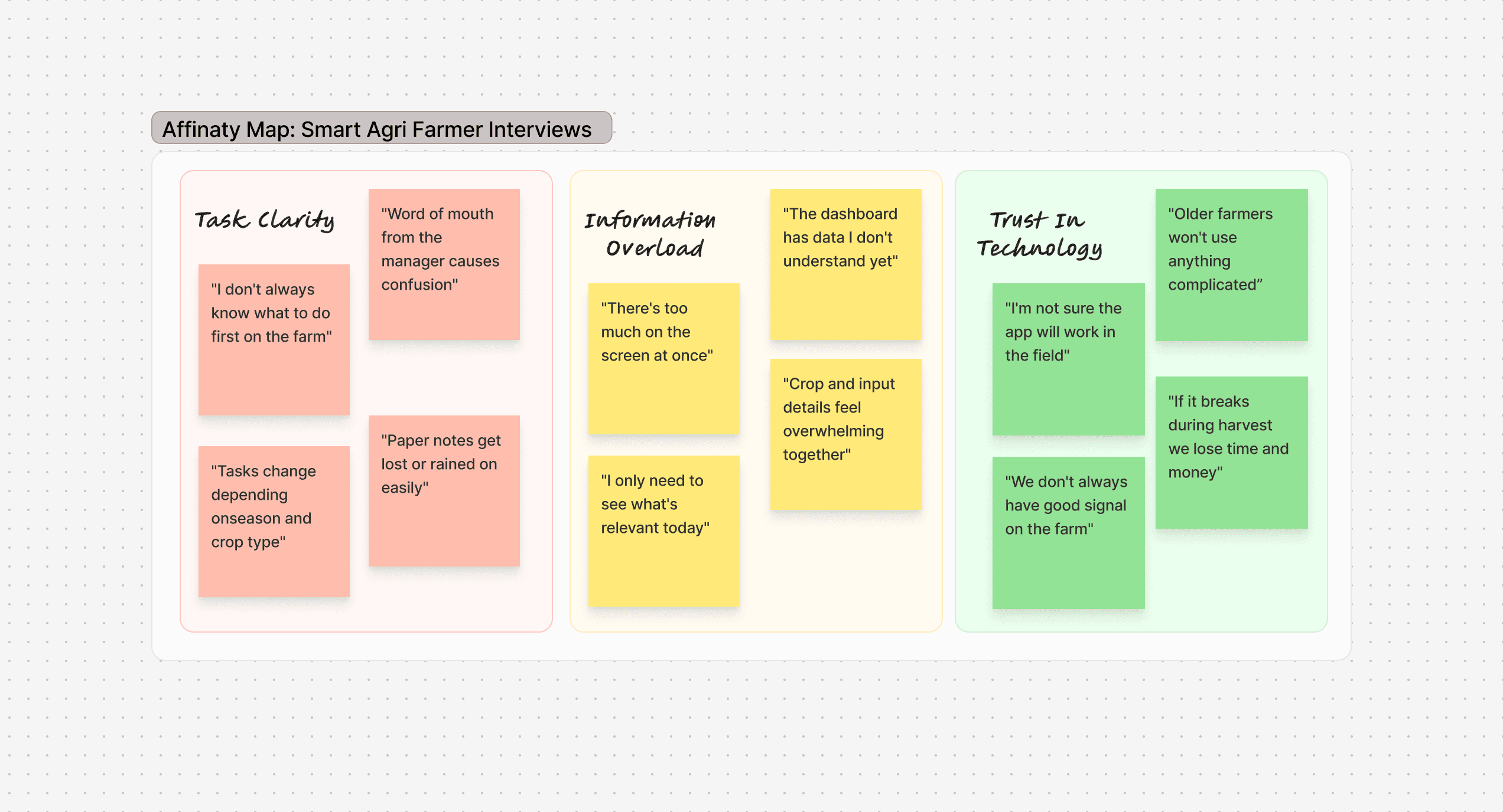
These clusters directly informed the core design decisions for FarmSwitch, from the task-first dashboard layout to the minimal UI approach.

Rather than designing for an average user, these personas helped the team make deliberate decisions about what to prioritise, what to simplify, and where the experience needed to flex to accommodate different farming contexts and goals.
SOLUTION
Redesigning the Farmer Dashboard
The dashboard went through two complete rethinks before the developers touched it. The first version I produced tried to honour every stakeholder's request, crop overview, input tracking, task summary, field status, weather integration. It was comprehensive. It was also immediately flagged by three farmers in early testing as overwhelming.
The rebuild wasn't just a visual simplification, it was a philosophical shift from "information display" to "decision support." The dashboard no longer tried to show the entire farm state; it showed what needed doing now, with everything else one tap away
What we cut (and why it mattered)
The weather widget and input-inventory panel were both cut from the MVP dashboard. The weather data required a third-party API integration that would have added 3–4 days of dev work and introduced an external dependency with no offline fallback. The inventory panel required backend infrastructure that wasn't ready. Cutting both meant we could ship the task flow properly rather than ship everything half-finished. That decision saved approximately one sprint of rework after launch

Reducing Cognitive Load in Task Management
The task card was the second major battleground. Requirements from the business analyst called for 11 separate data fields visible at list level. I ran an A/B test on the critical variable — task card density — and came out with a three-field card (task name, assigned worker, due status) that performed better on comprehension testing. That meant a direct conversation with the BA about what "needed" vs "nice to have" actually meant. We got to three fields. Developers thanked me.

Iterating the Task Detail Experience
The task detail page was the hardest screen to design because the constraints were genuinely in conflict. Farmers needed simplicity. The product needed to carry input quantities, compliance fields, proof-of-completion uploads, and a chain of approval actions, all in a mobile viewport. It went through six iterations. We landed on a scrollable card structure with contextual disclosure: the first view shows instructions and status only; input details and approval actions are revealed as the farmer progresses through the task.

CONCLUSION
Key Takeaways
This project taught me that designing for a context you don't live in requires you to listen more than you assume. Going into FarmSwitch, I understood the brief, but it took sitting with the actual farmers to understand what "simple" really meant in their world. Simple didn't mean fewer features. It meant fewer decisions to make at any given moment.
If I were to approach this again, I'd push for earlier and more frequent testing with farmers in the field, not just in structured interview settings. A lot of our iteration happened reactively, the dashboard redesign came after feedback that it was overwhelming, and while we got to a better place, catching that earlier would have saved cycles. I'd also want to test offline functionality much sooner. Connectivity constraints came up consistently in research but were treated as a later-stage concern, and in hindsight that should have been a day-one design constraint.
The 13% increase in task completion on the first iteration was a meaningful result, and the funding response from farm networks validated that the product was solving a real problem. But the more honest takeaway for me as a designer is that impact in this space is slow and incremental, the farmers using this app are running real businesses, and every design decision has a real consequence. That responsibility made me a more careful, more deliberate designer.
Next project

Creating a Design System to Modernise a New Product