Design System
UX Research
UI Design
Creating a
Design System
to Modernise a
New Product
Modernise Shesha’s visual Identity and create a scalable design system that could support its transition into a standalone product
ROLE
Lead Designer
TIMELINE
4 Months
TEAM
2 Designers
TOOLS
Figma
OVERVIEW
Building A Modern Design System that Will Unify a New Tool
Shesha had been in development for nearly 10 years. As it prepared to become its own independent company, the product's outdated UI was holding it back—giving users and potential clients a poor first impression of what was actually a powerful low-code platform.
IMPACT
Achievements
Since the partial rollout of the new design system to the public. We have seen a 42% increase in GitHub user participation.
Shesha now looks and feels like a modern, professional product, matching the quality of the platform underneath. Creating a strong visual identity.
Developers can now reference a single source of truth, reducing back-and-forth and implement inconsistencies. Creating a faster design-to-development handoff process.
PROBLEM
Brand Guidelines Without a System
When I joined, the team had brand guidelines and a UI Kit that documented fonts, colours, component styles, and input styles.
However, These were constructed several years ago. As it prepared to become its own independent company, the product's outdated UI was holding it back. This was giving users and potential clients a poor first impression of what was actually a powerful low-code platform.
While it defined how the UI looked, it lacked:
Modernised and responsive component foundations
Unified and robust Icon library for a growing component library
component behaviour that mapped to real product scenarios
Built scalable components in Figma aligned with Ant Design framework
Defined visual direction and component standards
APPROACH
Understanding How We Got Here?
We divided and conquered, conducting a full audit of Shesha's existing UI and evaluating how it impacted the overall user experience. After evaluating, I started reviewing existing UI across products to see where patterns repeated, broke, or were being improvised.
This helped in identifying what actually needed to be standardised. Furthermore, It was important for us to run usability tests and held in-depth discussions with developers to understand their pain points.
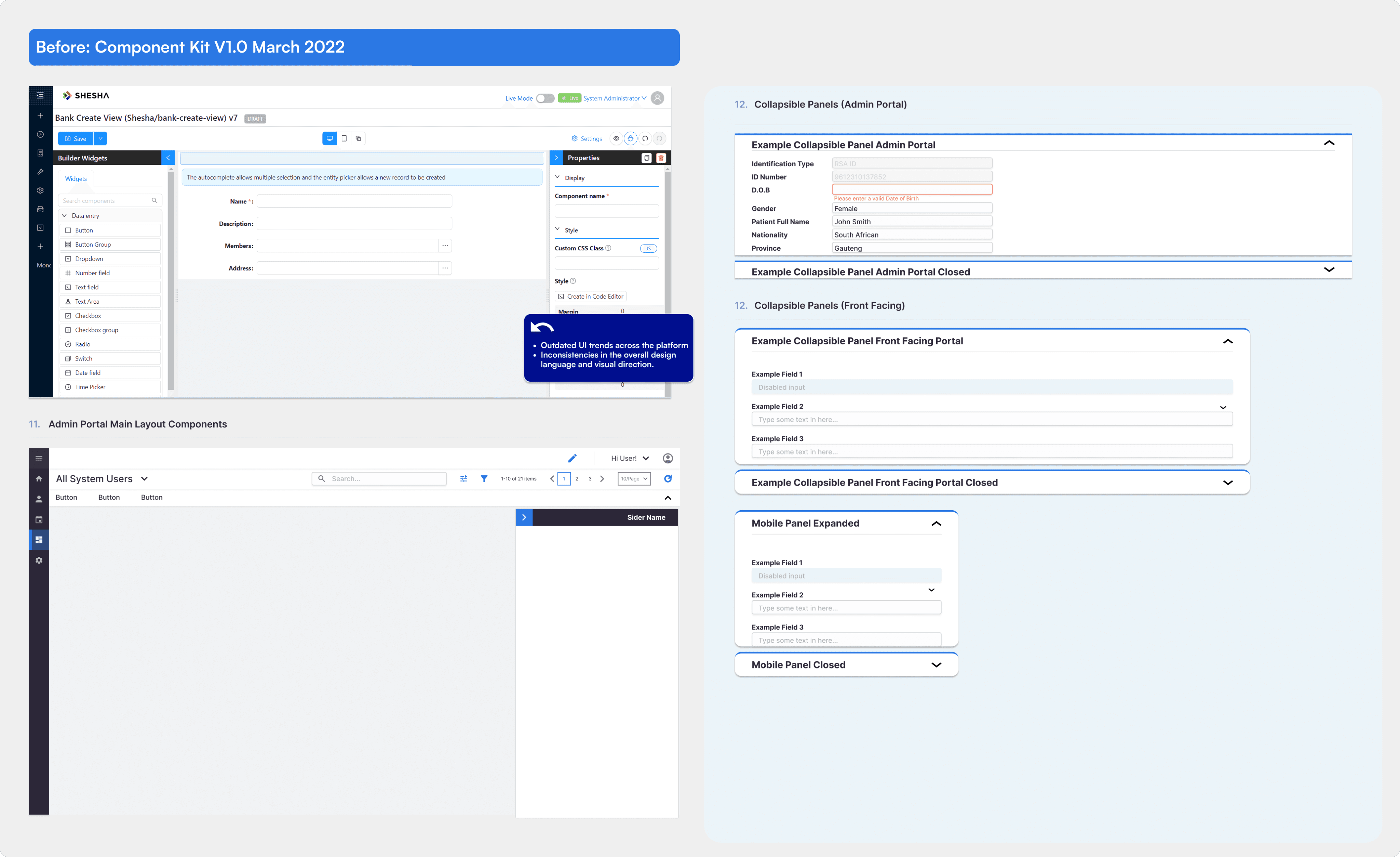
Outdated Visual Trends
The layout, components and inputs were designed with outdated UI trends that needed to be updated with the new trends that will help Shesha come to the ever evolving future.
Inconsistent Design Language
Too many contributors over the years meant inconsistent fonts, typography, spacing, and iconography across the platform.
Limited Icon Library
The existing icons couldn't support Shesha's custom components, forcing designers and developers into awkward workarounds.
SOLUTION
A Shared System Teams Could Actually Use
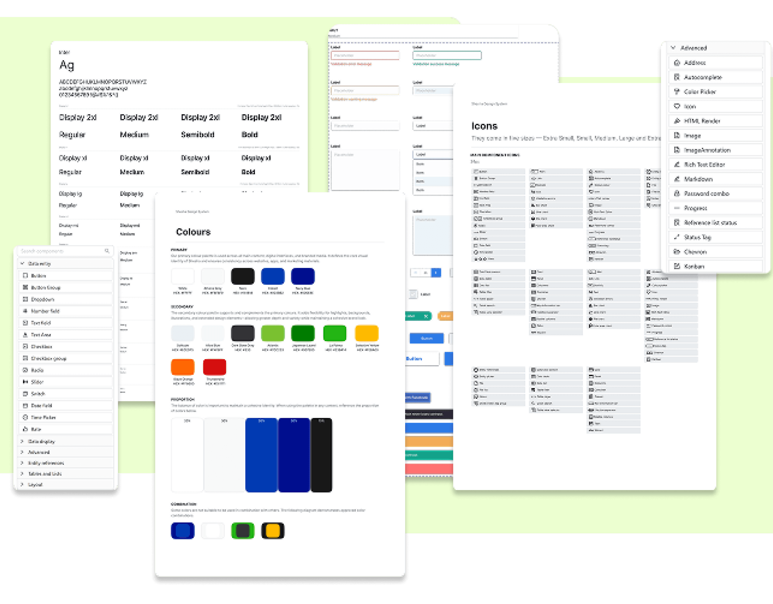
The result was the company's first design system since launching as an independent company. It is currently being used across web, mobile and internal tools. It standardised core interactions and visual foundations while remaining flexible enough for growth within Shesha and the product needs.
Modernised component library
Enhanced existing Ant Design components with Shesha's visual language. Avoided unnecessary rework by keeping what already worked well.

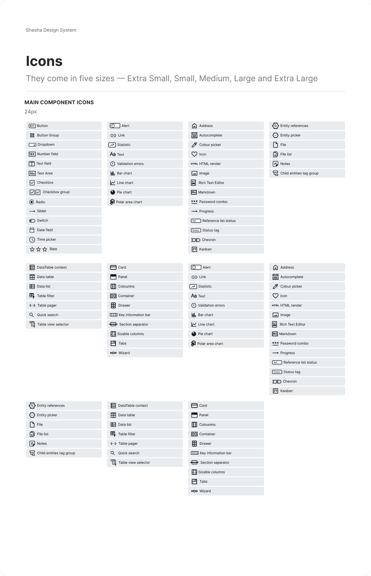
Bespoke icon library
I proposed and led the creation of a custom icon set specifically designed for Shesha's unique components and use cases.
Unified typography & colour system
Standardised fonts, type scales, and colour tokens to eliminate inconsistencies across the platform.

NEXT
SmartAgri Mobile App
Agritech | 2024 - 2025
NEXT
Shesha Feedback Tool
Internal Tool | 2024
Design System
UX Research
UI Design
Creating a
Design System
to Modernise a
New Product
Modernise Shesha’s visual Identity and create a scalable design system that could support its transition into a standalone product
ROLE
Lead Designer
TIMELINE
4 Months
TEAM
2 Designers
TOOLS
Figma
OVERVIEW
Building A Modern Design System that Will Unify a New Tool
Shesha had been in development for nearly 10 years. As it prepared to become its own independent company, the product's outdated UI was holding it back—giving users and potential clients a poor first impression of what was actually a powerful low-code platform.
IMPACT
Achievements
Since the partial rollout of the new design system to the public. We have seen a 42% increase in GitHub user participation.
Shesha now looks and feels like a modern, professional product, matching the quality of the platform underneath. Creating a strong visual identity.
Developers can now reference a single source of truth, reducing back-and-forth and implement inconsistencies. Creating a faster design-to-development handoff process.
PROBLEM
Brand Guidelines Without a System
When I joined, the team had brand guidelines and a UI Kit that documented fonts, colours, component styles, and input styles.
However, These were constructed several years ago. As it prepared to become its own independent company, the product's outdated UI was holding it back. This was giving users and potential clients a poor first impression of what was actually a powerful low-code platform.
While it defined how the UI looked, it lacked:
Modernised and responsive component foundations
Unified and robust Icon library for a growing component library
component behaviour that mapped to real product scenarios
Built scalable components in Figma aligned with Ant Design framework
Defined visual direction and component standards
APPROACH
Understanding How We Got Here?
We divided and conquered, conducting a full audit of Shesha's existing UI and evaluating how it impacted the overall user experience. After evaluating, I started reviewing existing UI across products to see where patterns repeated, broke, or were being improvised.
This helped in identifying what actually needed to be standardised. Furthermore, It was important for us to run usability tests and held in-depth discussions with developers to understand their pain points.
Outdated Visual Trends
The layout, components and inputs were designed with outdated UI trends that needed to be updated with the new trends that will help Shesha come to the ever evolving future.
Inconsistent Design Language
Too many contributors over the years meant inconsistent fonts, typography, spacing, and iconography across the platform.
Limited Icon Library
The existing icons couldn't support Shesha's custom components, forcing designers and developers into awkward workarounds.
SOLUTION
A Shared System Teams Could Actually Use
The result was the company's first design system since launching as an independent company. It is currently being used across web, mobile and internal tools. It standardised core interactions and visual foundations while remaining flexible enough for growth within Shesha and the product needs.
Modernised component library
Enhanced existing Ant Design components with Shesha's visual language. Avoided unnecessary rework by keeping what already worked well.
Bespoke icon library
I proposed and led the creation of a custom icon set specifically designed for Shesha's unique components and use cases.
Unified typography & colour system
Standardised fonts, type scales, and colour tokens to eliminate inconsistencies across the platform.
PREVIOUS
Shesha Design System
Design System | 2023
NEXT
Shesha Design System
Design System | 2023